Aspect Ratios and Image Galleries
I honestly adore having totally free weekends that enable me to spontaneously redesign my image galleries, and learn about a few new tools along the way. I’m not 100% satisfied with the way this came out, but it gave me another option to play with, and I built a neat custom liquid tag to surface the aspect ratio of media files!
The Process
I have some files in the repo for this blog to display photos and videos in grids - e.g. as displayed in this post about the eclipse.
It occurred to me yesterday that it wouldn’t be particularly hard to make a combined grid - of both images and videos. So I made a new include file that detects the filetype and renders it appropriately. (Now that I’m detecting the filetype, I can also accurately specify the media type as quicktime for .mov files, instead of setting all videos to “video/mp4”!).
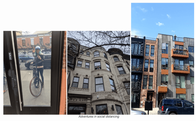
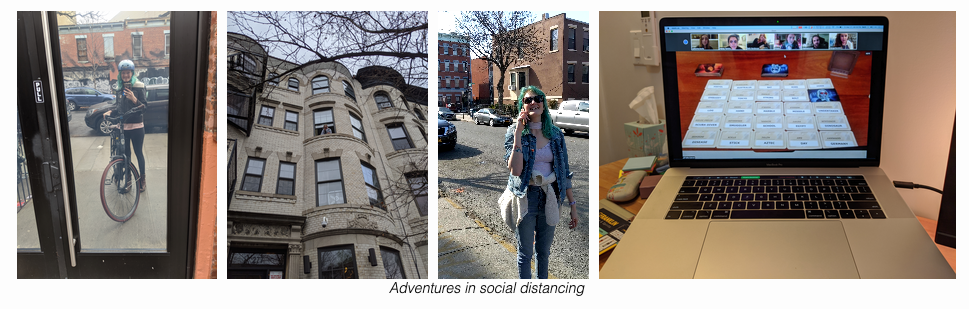
So I did this, and it worked totally fine! But it brought me face-to-face with the way that my existing grids handle files with different aspect ratios (it’s especially dramatic when comparing a 4x3 video to a 2x3 or 3x2 photo).
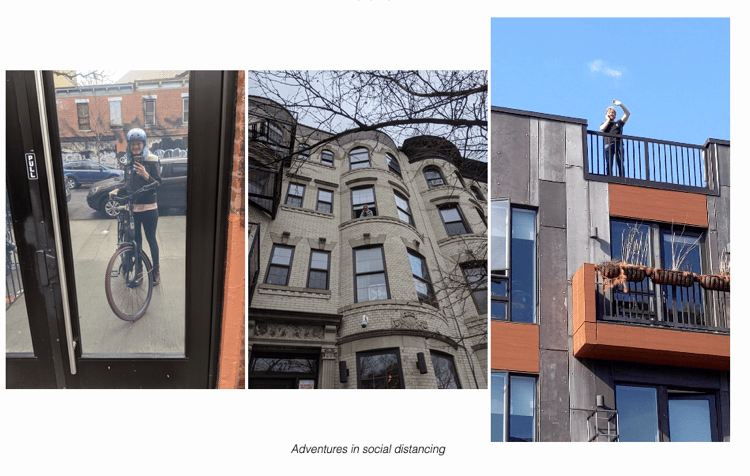
It’s totally adequate, but not super aesthetically pleasing. Just the project for an unexpectedly snowy May Saturday!
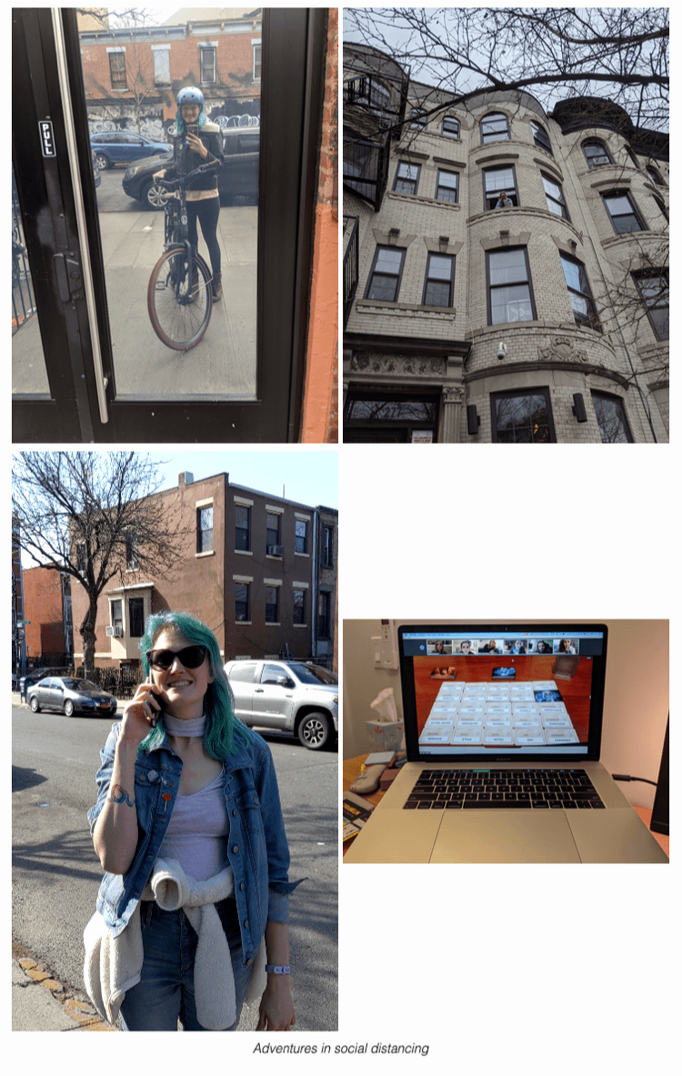
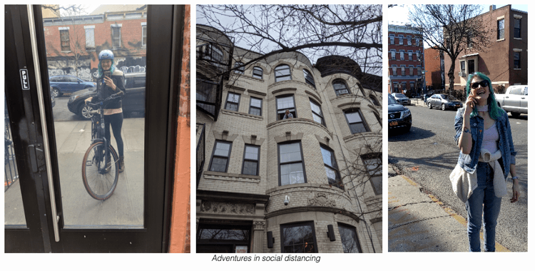
My first step was to immediately fix the vertical-align so that they’d all have the same baseline, as seen here:
At this point I started wondering what an actual solution might look like - both in the UI sense (what did I want?) and a technical sense (how could I build it?).
Inspired by this post, I figured Flex and aspect ratios might be the way to go. When I first saw this I thought it was some black-magic, but it turns out the flex-grow property works as a proportion. Flex works out how many items can fit on a row and then adds up the flex-grow values for the row and distributes the elements proportionally. The flex-basis and width are used to calculate how many items can fit on a row: a flex-bases of 0 and a a min-width of 0 means all items will go onto the same row.
So if you have 3 items on a row:
- flex-grow: 1
- flex-grow: 2
- flex-grow: 1
Then the items will have widths such that they’re proportional and sum to 100%:
- width: 25%
- width: 50%
- width: 25%
You can do the same thing with aspect ratios! If we have these 3 items:
- flex-grow: 1.77 (a wide photo)
- flex-grow: 0.56 (a tall video)
- flex-grow: 0.75 (a 3x4 portrait photo)
We’ll wind up with:
- width: 57% => (1.77 / (1.77 + 0.56 + 0.75))
- width: 18%
- width: 25%
Here’s the HTML and CSS to make this happen:
HTML
<figure style="width: 100%;">
    <div class="media-grid-container">
        <!-- NB: This is where we have to hard-code in the aspect ratio -->
        <div class="media-grid-element" style="flex-grow:<aspect ratio>;">
            <video autoplay controls muted loop>
                <source src="src" type="video/mp4">
            </video>
        </div>
        ...
        <div class="media-grid-element" style="flex-grow:<aspect ratio>;">
            <img src="src"/>
        </div>
    </div>
    <figcaption>caption</figcaption>
</figure>
CSS
.media-grid-container {
display: flex;
flex-wrap: wrap;
column-gap: 10px;
row-gap: 10px;
justify-content: space-evenly;
}
.media-grid-element {
flex-basis: 0;
}
img, video {
max-width: 100%;
vertical-align: bottom;
max-height: 100%;
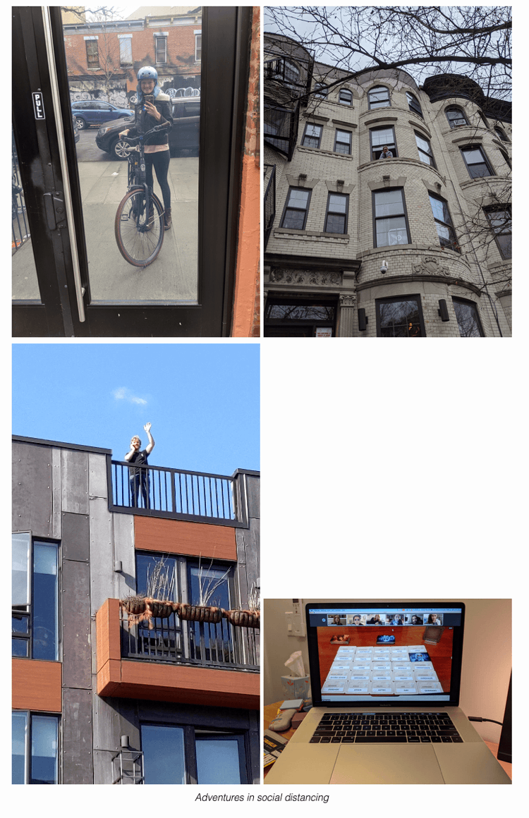
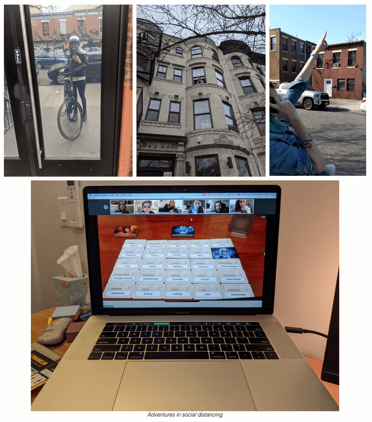
}Here’s what that looks like:
Big improvement IMO! But a bit untenable to have to hard-code in the aspect ratio (like is done in the site I was referencing). I needed a way to automatically generate the aspect ratio for a source file, and after googling around, jekyll-image-size seemed pretty close…unfortunately the supported files don’t include videos.
At this point I figured I’d write my own Jekyll Tag Plugin! I don’t normally write Ruby: I have 2 existing custom plugins for this blog (category and tag generators) which I built from a tutorial back in 2015 when I first spun this up. But what the heck - I’m creatively blocked on 2 other projects right now, so it seemed fun to take on a straightforward self-contained challenge.
I looked into using Paperclip::Geometry after I saw it mentioned on StackOverflow, but the library appears to have been deprecated, so I went looking for something still supported. This post led me to mini_exiftool, which is very straightforward (although the documentation leaves much to be desired). I had to install that through brew, as well as adding the gem, but then I was good to go.
…
You can find my first ever gem (!) published at RubyGems, or check out the source code on github
Here’s a snippet:
if (File.file?(abspath))
    mediaObj = MiniExiftool.new abspath
    height = mediaObj.image_height
    width = mediaObj.image_width

    # If the video is rotated, we need to swap width and height
    if mediaObj.rotation == 90 or mediaObj.rotation == 270
        temp = height
        height = width
        width = temp
    end

    # Avoid division by zero errors
    if height != 0
        output = (width.to_f/height.to_f).truncate(2)
    end
end
At this point I could have called it a day, but I started to wonder what would happen if I had too many files to reasonably fit on one line? I suppose ideally you’d have some kind of minimum height per line, or maximum number of items per line, and create a new row if the conditions aren’t met - each row still remaining at a consistent height.
What I ended up with is pretty close to that - I gave each item a minimum width, which allows flex-wrap to automatically wrap them, but does mean that sometimes items can’t be their min-width and the same height as everything else. The end result of scratching this itch was a lesson in compromise - I decided to let Flex figure out which of my constraints to prioritize, rather than writing something to adjudicate between rules.
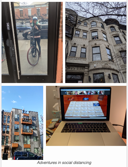
That looks like:
The additional CSS to do this is very straightforward, and there’s no additional HTML at all.
CSS
.media-grid-element {
    min-width: max(25%, 150px); /* Aim for 3 on a row, depending on screen size */
}
NB: There is actually some additional HTML in my version, which is restricting the bottom image to not be 100% of the width - it’s capping the height at 600px. This requires nesting the image/video inside another div if you don’t want the image to stretch. Because of course it does 🙃
Find me on twitter if you have any questions. Happy hacking!
-Beth